Marketing Reports
Overview
The Marketing Reports section provides visual and tabular data about lead performance across sources, campaigns, and Lead IDs.
Available Reports
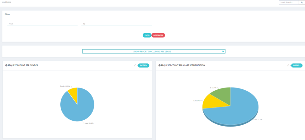
1. Lead Rates
Pie charts showing lead distribution by demographic and behavioral data.
Charts include:
- Requests Count per Gender — Male vs Female breakdown.
- Requests Count per Class Segmentation — A+, A, B, C segments.
- Requests Count per Purpose — Purpose of inquiry (e.g., For Children, Not Determined).
- Requests for Gender According to Sources — Male/Female breakdown per source.
- Age Group According to Requests Count — Leads by age range (20–30, 30–40, 40–50, 50–60, 60+).
- Classes According to Sources Requests — Segment quality per source.
Filter: Date range (From / To). Toggle between All Leads or specific segments using the dropdown.
Export: Each chart can be exported individually.
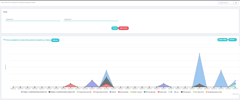
2. Total Number of Leads Per Lead ID (Graph & Table)
A line/area graph showing leads coming in per Lead ID over time.
- X-axis: Date
- Y-axis: Number of leads
- Each Lead ID is color-coded
- Toggle Show Table to see the data in table format
Filter: Date range (From / To).
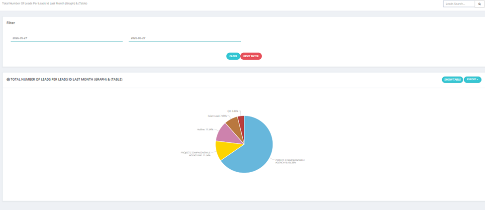
3. Total Number of Leads Per Lead ID Last Month (Graph & Table)
Same as above but defaults to last month's data — shown as a pie chart.
Each slice represents a Lead ID and its percentage of total leads.
Filter: Date range (From / To).
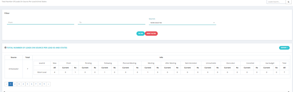
4. Total Number of Leads on Source Per Lead ID and States
A detailed table showing leads broken down by Source → Lead ID → State.
For each Lead ID under a source, shows:
- New, Fresh, Pending, Following, Planned Meeting, Meeting, After Meeting, Not Interested, Unreachable, Done-deal, Cancelled, Low Budget
- Current count vs Re (returned) count per state
Filter: Date range (From / To), Sources.
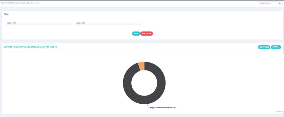
5. Total Number of Leads on Campaigns Per Lead ID
Donut chart showing the distribution of leads across campaigns per Lead ID.
Toggle Show Table for tabular view.
Filter: Date range (From / To).
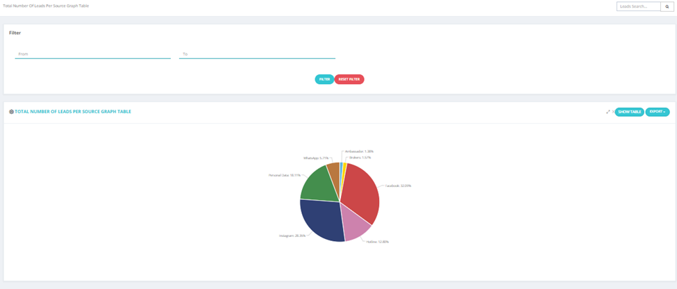
6. Sources Per States
Pie chart showing lead states distribution per source — how many leads from each source are in each state.
Supports both Graph View and Table View.
Filter: Date range (From / To).
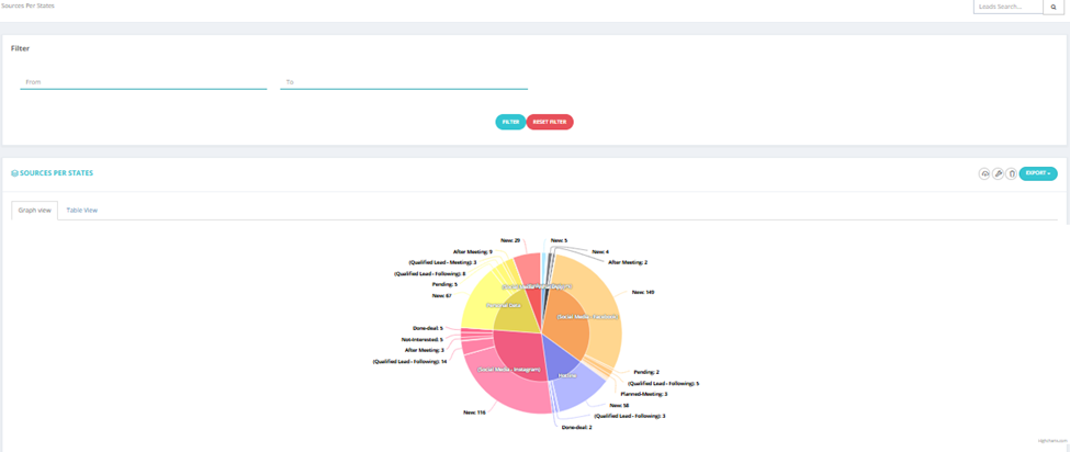
7. Total Number of Leads Per Source (Graph & Table)
Pie chart showing the percentage of total leads coming from each source (e.g., Facebook 32%, Instagram 28%, Hotline 13%).
Toggle Show Table for a breakdown by numbers.
Filter: Date range (From / To).
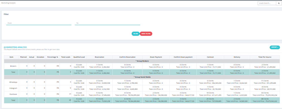
8. Marketing Analysis
A comprehensive financial performance table grouped by source groups (e.g., Brokers, Social Media).
Columns include:
- Item — Source name.
- Planned / Actual / Deviation / Percentage % — Budget tracking.
- Total Leads — Total leads from this source.
- Qualified Lead — Leads that progressed beyond fresh state.
- Reservation / Confirm Reservation / Down Payment / Confirm Down Payment / Contract / Delivery — Units count and total unit price at each stage.
- Total Per Source — Combined clients and unit value.
💡 Default view is the current month. Use filters to extend the date range.
Filter: Date range (From / To).